

Data visualization software makes it easier to turn complex spreadsheets, databases, and business reports into charts, dashboards, graphs, and interactive visualizations that are far easier to understand.
Whether you’re a business analyst creating KPI dashboards, a researcher plotting scientific statistical data, or a marketer building presentation-ready charts, there are now plenty of excellent data visualization tools that work on Mac.
Some users may also require specialized diagramming applications for creating flowcharts, organizational charts, and network diagrams, which can complement traditional data visualization tools.
The good news for Mac users is that many modern data visualization platforms are either fully native macOS applications or cloud-based tools that run perfectly in Safari, Chrome, and other browsers. Several even offer native Apple Silicon support for M-series Macs.
After testing dozens of solutions, these are the best data visualization tools for Mac.
The Best Data Visualization Software for Mac
| Software | Best For | Mac Support | Free Version | Price |
|---|---|---|---|---|
| Tableau | Overall business analytics | Native app | Tableau Public | From $75/month |
| Flourish | Interactive storytelling | Web-based | Yes | From $79/month |
| Google Data Studio | Free dashboards | Browser | Yes | Free |
| Qlik Sense | Enterprise analytics | Browser | Trial | Custom |
| DataGraph | Scientific graphing | Native app | No | One-time purchase |
| Grafana | IT monitoring | Browser | Yes | Free |
| Plotly | Data science | Browser/Python | Yes | Free |
| Zoho Analytics | Small businesses | Browser | Trial | From $24/month |
| Domo | Enterprise dashboards | Browser | Trial | Custom |
| Apple Grapher | Mathematical plotting | Built into macOS | Yes | Free |
1. Tableau
Best overall data visualization software for Mac
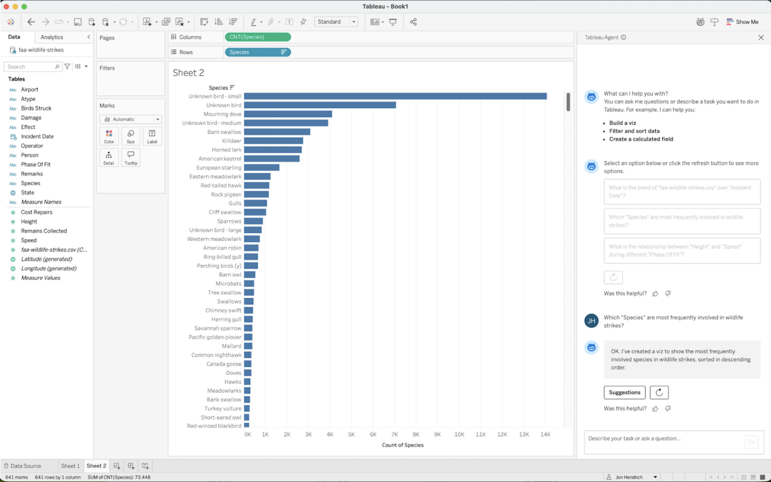
Tableau remains the industry standard for business intelligence and visual analytics.
Its drag-and-drop interface makes it relatively easy to create dashboards, charts, maps, and reports without extensive technical knowledge. Tableau can connect to spreadsheets, SQL databases, cloud applications, and large enterprise data warehouses.
The Mac version runs natively on macOS and supports Apple Silicon Macs.
Particularly impressive features include:
- Interactive dashboards
- Geographic mapping
- AI-assisted analytics
- Real-time data connections
- Predictive forecasting
- Advanced calculations
Tableau is ideal for analysts, managers, consultants, and organizations that need highly polished dashboards.
Pros
- Excellent Mac support
- Powerful visualizations
- Huge range of data connectors
- Large user community
- Scales from small teams to enterprises
Cons
- Expensive
- Steeper learning curve
- Can be overkill for simple charts
Price: From $75 per month.
2. Flourish
Best for interactive storytelling
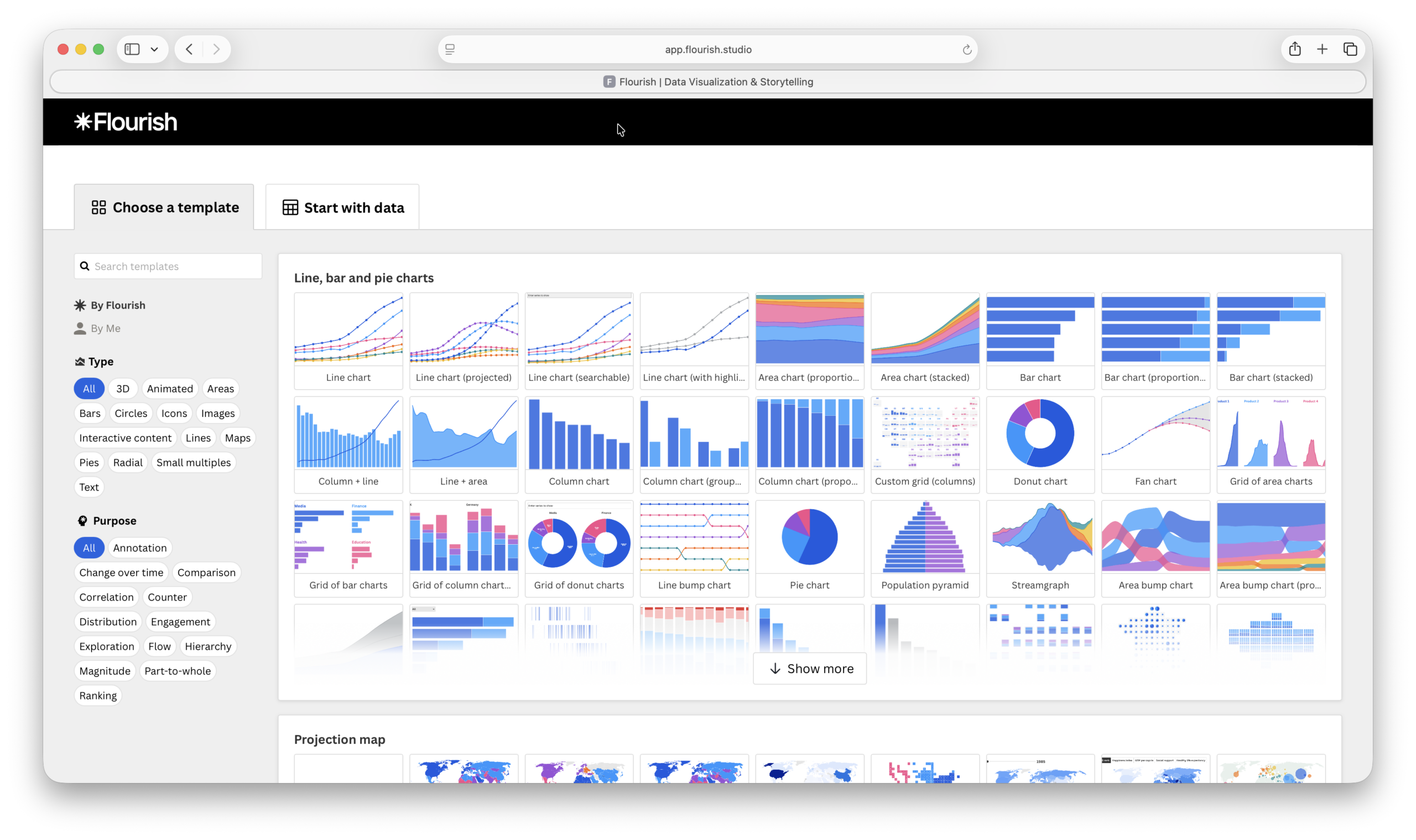
Flourish focuses on creating attractive, interactive visualizations that can easily be embedded in websites, presentations, and reports.
Journalists, marketers, educators, and content creators frequently use Flourish to build:
- Animated charts
- Interactive maps
- Data stories
- Scrollytelling presentations
- Infographics
Because Flourish runs entirely in the browser, it works perfectly on Macs without requiring software installation.
Its templates make it easy to produce professional visualizations quickly.
Pros
- Beautiful visual output
- Very easy to use
- Excellent templates
- Interactive presentations
- Browser-based
Cons
- Less suitable for enterprise analytics
- Limited advanced data analysis
Price: Free plan available.
3. Google Data Studio
Best free data visualization software
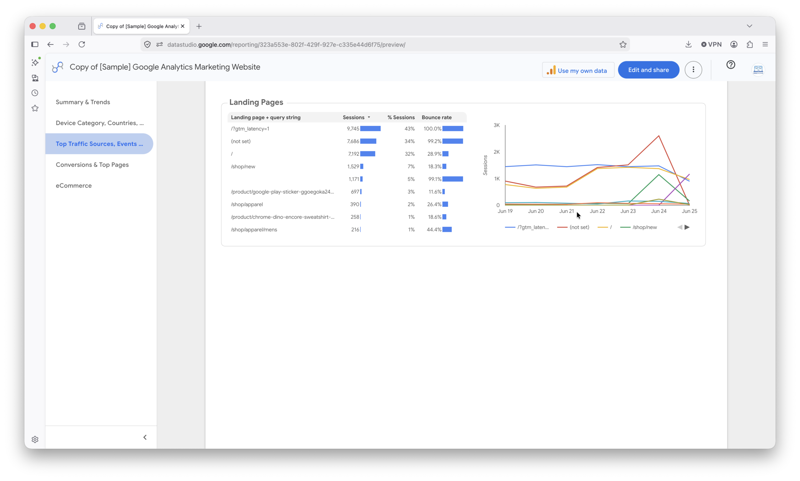
Google Data Studio (formerly Looker Studio) offers one of the best free dashboard platforms available.
It connects directly with:
- Google Analytics
- Google Sheets
- Google Ads
- BigQuery
- YouTube
- Search Console
For many small businesses and website owners, Data Studio provides everything necessary to create professional dashboards.
The browser-based interface works extremely well on Macs.
Pros
- Completely free
- Excellent Google integrations
- Easy dashboard sharing
- Simple interface
Cons
- Limited advanced analytics
- Fewer customization options
Price: Free.
4. Qlik Sense
Best enterprise analytics platform
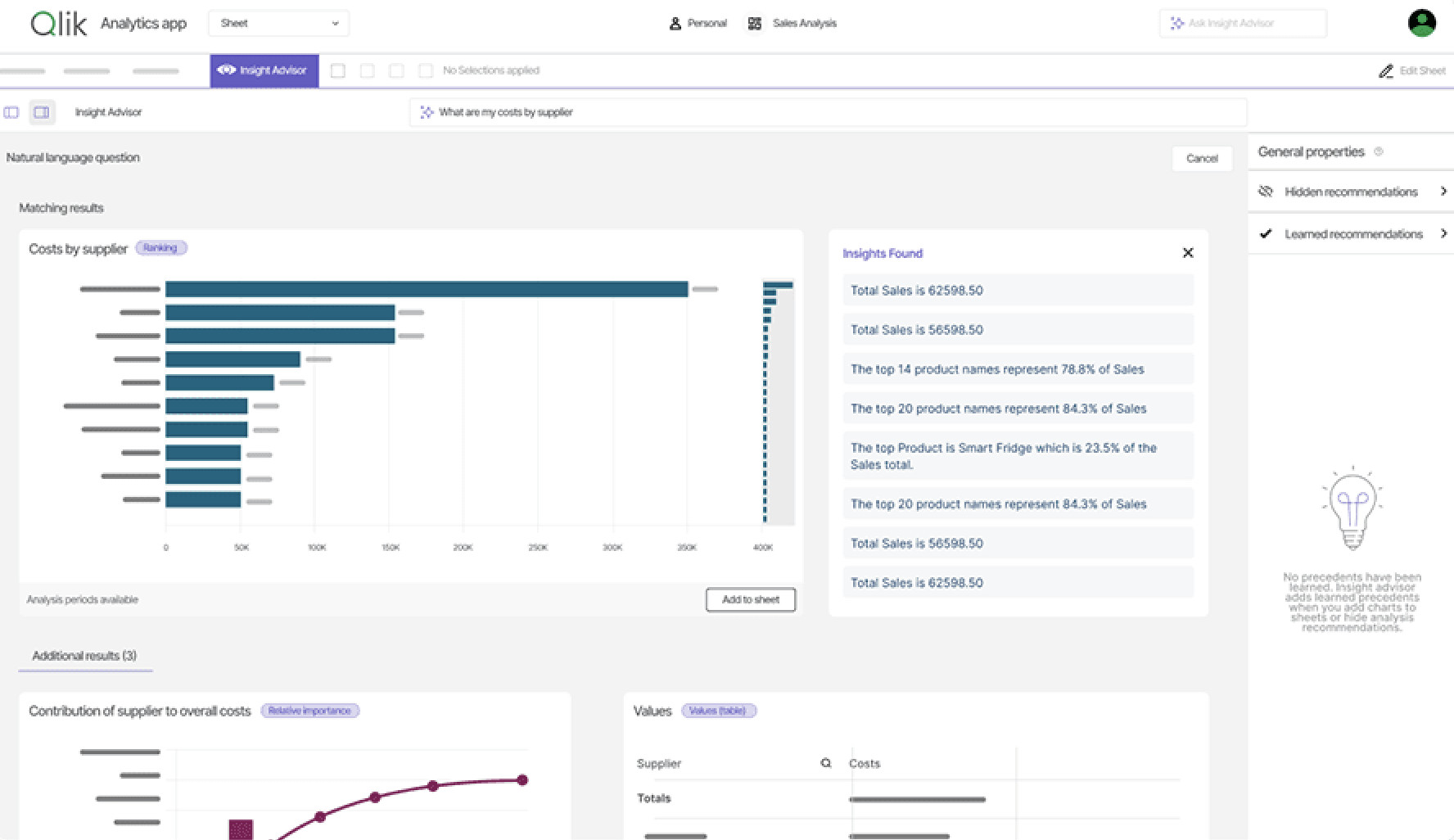
Qlik Sense is a powerful business intelligence platform designed for large organizations.
Its associative data engine allows users to explore relationships between data points without being restricted to predefined queries.
This makes it particularly useful for:
- Financial analysis
- Sales reporting
- Operational analytics
- Enterprise dashboards
Although Qlik Sense primarily operates in the browser, Mac users can access the entire platform without compatibility issues.
Pros
- Powerful analytics engine
- Excellent scalability
- Strong AI capabilities
- Enterprise-grade security
Cons
- Expensive
- Requires training
- More suitable for larger organizations
Price: Custom pricing.
5. DataGraph
Best for scientific and research data
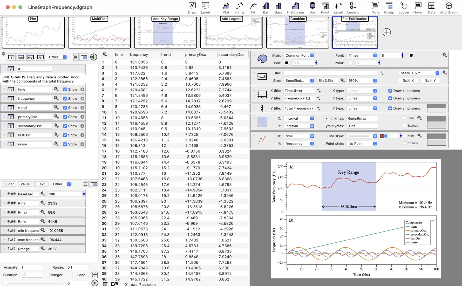
DataGraph is one of the few visualization tools developed specifically for macOS.
Researchers, engineers, and scientists can use it to create highly detailed publication-quality charts and graphs.
Features include:
- Curve fitting
- Statistical analysis
- 2D and 3D graphing
- Large dataset support
- Scientific plotting
The native Mac interface feels right at home on macOS.
Pros
- Designed specifically for Mac
- Excellent scientific features
- Publication-quality output
- Highly customizable graphs
Cons
- Limited business dashboarding
- Smaller user community
Price: One-time purchase.
6. Grafana
Best for IT and system monitoring
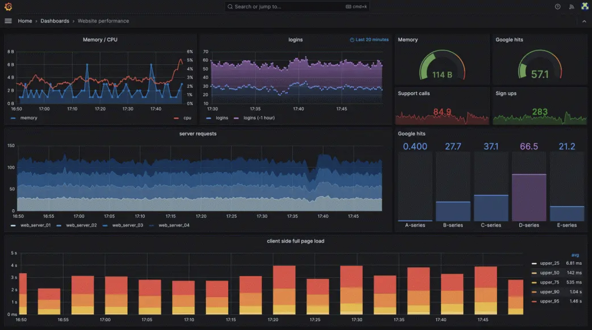
Grafana is widely used for visualizing:
- Server metrics
- Network performance
- Application monitoring
- Infrastructure data
- DevOps dashboards
Its dashboard system allows teams to monitor real-time data from numerous sources.
Developers and IT administrators often pair Grafana with:
- Prometheus
- InfluxDB
- Elasticsearch
Grafana runs entirely in the browser and works exceptionally well on Mac.
Pros
- Free version available
- Excellent real-time dashboards
- Large plugin ecosystem
- Highly customizable
Cons
- Technical learning curve
- Less suitable for business users
Price: Free.
7. Plotly
Best for data scientists
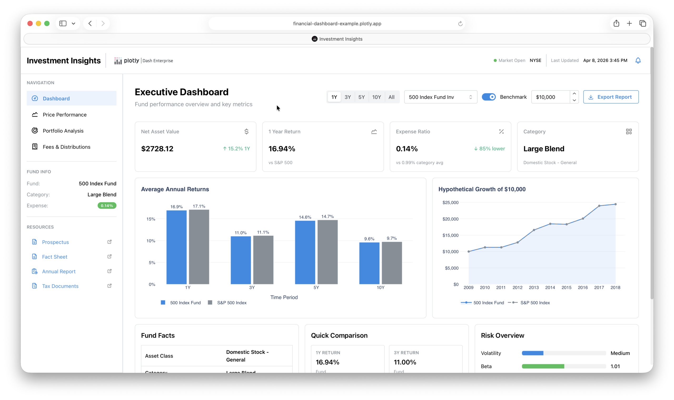
Plotly is particularly popular among Python and R users.
It enables developers and data scientists to create highly interactive charts and visualizations.
Supported chart types include:
- Scatter plots
- Heat maps
- 3D visualizations
- Statistical charts
- Scientific visualizations
Plotly integrates well with Jupyter notebooks and machine learning tools.
Pros
- Extremely flexible
- Excellent for Python users
- Interactive charts
- Free options available
Cons
- Requires technical knowledge
- Not ideal for business users
Price: Free.
8. Zoho Analytics
Best for small businesses
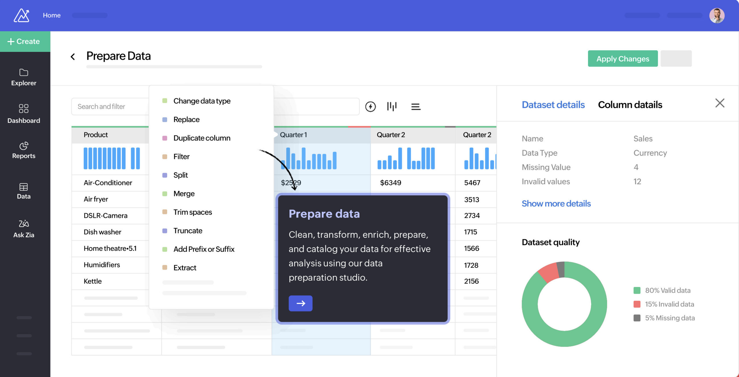
Zoho Analytics offers many business intelligence features at a lower price than enterprise competitors.
Users can create:
- KPI dashboards
- Business reports
- Sales analytics
- Financial reports
- Marketing dashboards
It integrates with many popular applications, including CRM and accounting platforms.
Pros
- Affordable pricing
- Good business features
- Easy setup
- Strong integrations
Cons
- Less powerful than enterprise tools
- Interface occasionally feels dated
Price: From $24 per month.
9. Domo
Best for executive dashboards

Domo focuses heavily on executive reporting and company-wide dashboards.
Its cloud-based platform enables organizations to consolidate information from multiple systems into a single reporting environment.
Domo is particularly strong for:
- Executive reporting
- KPI dashboards
- Business performance monitoring
Pros
- Excellent dashboard design
- Strong mobile apps
- Enterprise features
Cons
- Expensive
- Better suited to large businesses
Price: Custom pricing.
10. Apple Grapher
Best free built-in visualization tool

Many Mac users don’t realize that Grapher is already installed with macOS.
Found inside the Utilities folder, Grapher allows users to create:
- 2D graphs
- 3D graphs
- Mathematical plots
- Equation visualizations
Although limited compared to dedicated visualization software, it’s surprisingly useful for students and educators.
Pros
- Completely free
- Already installed on macOS
- Simple to use
- Excellent mathematical plotting
Cons
- Very limited features
- No business analytics
Price: Free.
Does Power BI Work on Mac?
Microsoft Power BI does not offer a native macOS desktop application.
However, Mac users can still access Power BI through:
While this approach works, it is generally less convenient than tools that offer native Mac support.
For more, check out our guide on how to run Power BI on a Mac.
Native Mac Apps vs Browser-Based Tools
Modern data visualization software generally falls into two categories.
Native Mac Applications
- Tableau
- DataGraph
- Apple Grapher
Advantages:
- Better performance
- Offline access
- Native macOS features
Cloud-Based Platforms
- Flourish
- Looker Studio
- Grafana
- Domo
- Qlik Sense
Advantages:
- No installation required
- Easier collaboration
- Automatic updates
Most business users will find cloud-based platforms perfectly suitable.
Apple Silicon Compatibility
| Software | Apple Silicon Support |
| Tableau | Native |
| DataGraph | Native |
| Flourish | Browser |
| Looker Studio | Browser |
| Grafana | Browser |
| Qlik Sense | Browser |
| Plotly | Browser |
| Zoho Analytics | Browser |
| Domo | Browser |
| Apple Grapher | Native |
How We Tested
To evaluate these applications we considered:
- Mac compatibility
- Ease of use
- Dashboard quality
- Chart customization
- Data source support
- Collaboration features
- Pricing
- Performance on Apple Silicon Macs
We also looked at how suitable each platform is for different types of users, from researchers and students to analysts and enterprise teams.
FAQ
What is the best data visualization software for Mac?
Tableau is the best overall data visualization software for Mac due to its powerful analytics capabilities, native macOS support, and extensive visualization options.
What is the best free data visualization software?
Looker Studio offers the strongest free solution for business dashboards, while Apple Grapher is a useful built-in option for mathematical visualizations.
Does Tableau work on Mac?
Yes. Tableau provides a native macOS application that supports Apple Silicon Macs.
Is Power BI available for Mac?
No. Microsoft does not offer a native Power BI desktop application for macOS.
What software do data analysts use?
Many analysts use Tableau, Qlik Sense, Looker Studio, Power BI, and Plotly depending on their requirements.
Is data visualization software the same as diagram software?
No. Data visualization software focuses on charts, dashboards, and analytics, while diagram software is designed for creating flowcharts, process maps, organizational charts, and other visual representations of relationships and workflows.
What is the difference between business intelligence software and data visualization software?
Business intelligence software includes reporting, data analysis, and dashboarding features, while data visualization software focuses primarily on presenting data visually.